More Climate Data Than You Ever Knew Existed
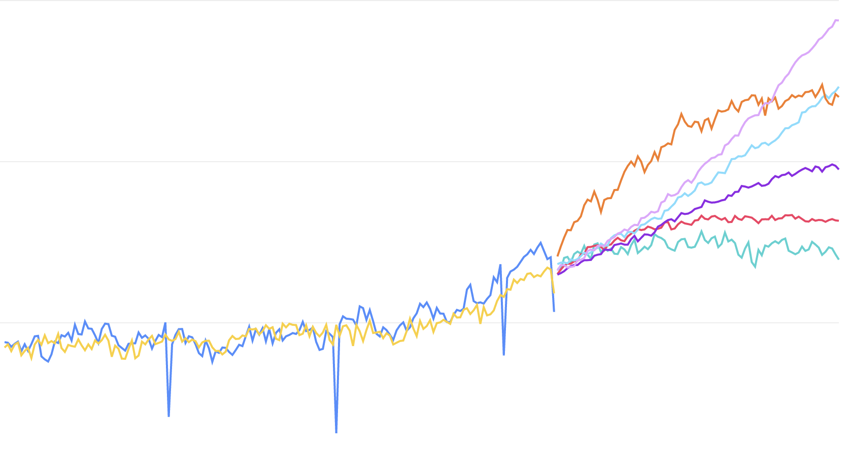
We’ve all seen graphs like this in the New York Times, showing mean global temperature into the future based on several different carbon emission scenarios:
Ever wonder where the data for those graphs come from? They come from something called the Coupled Model Intercomparison Project (CMIP6). The project is a huge collaboration of many different climate labs all over the world, representing the work of hundreds of scientists and thousands of hours of supercomputer simulations.
There’s so much more than just global mean temperatures available, though. The scientific community has created projections for hundreds of variables (snow coverage, precipitation, etc) in resolutions as small as 50km squares and in time steps as small as daily, projected out into the year 2100. All of the data is there for the using.
There’s one problem.
The data is locked up in an Earth-science-specific format called netCDF that’s extremely difficult for non-scientists to understand and even harder to stitch together with other, non-climate data sets.
And the data, itself, is HUGE.
We’ve got you covered. We’ve already downloaded and reprocessed a useful subset of the data into more recognizable formats that are easier to process in SQL and connect to your other data. And since you use Snowflake as your data warehouse (that is why you landed on this page, right?), we can share it to you in their data marketplace without even having to move it, getting you up to speed in just moments and ready to analyze your own exposures to climate change.
There’s a lot of knowledge you have to build up to make the best use of this data. That’s ok. We’ve written a good tutorial to get your oriented so you don’t have to navigate the acroynm-soup in the scientific community to get your bearings.